A Side Table That Actually Hides Books in Plain Sight
A Side Table That Actually Hides Books in Plain SightMost side tables are liars. They show up looking clean, then gradually become the household surface nobody planned for: stacked magazines, a charging cable, three...

Most side tables are liars. They show up looking clean, then gradually become the household surface nobody planned for: stacked magazines, a charging cable, three remote controls, and that one book you’ve been meaning to finish for six weeks. The table itself never had a real answer for any of it, just a flat top and occasionally a drawer that rattles. The clutter isn’t a behavior problem. It’s a design problem, and most furniture refuses to admit it.
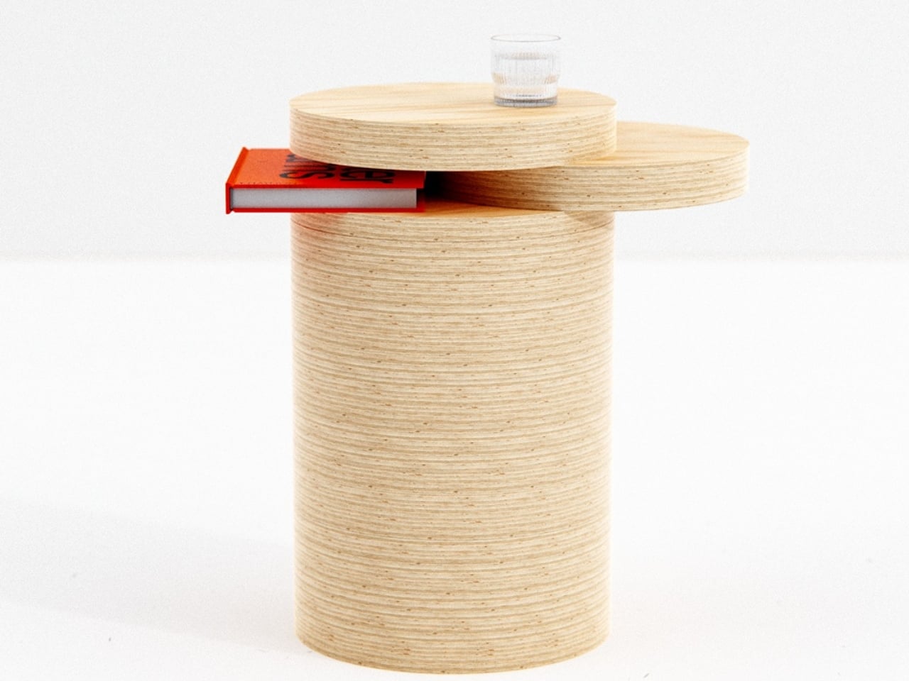
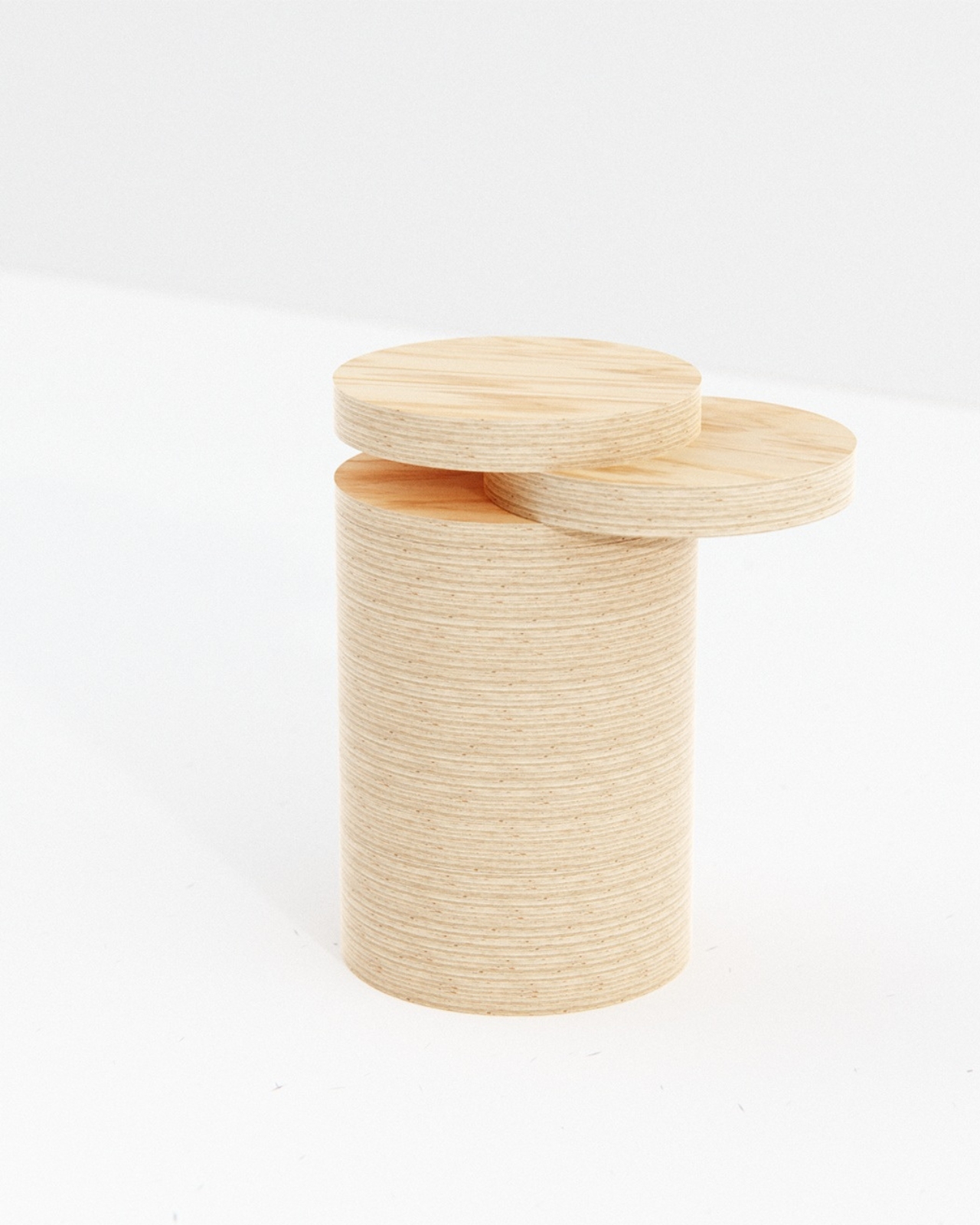
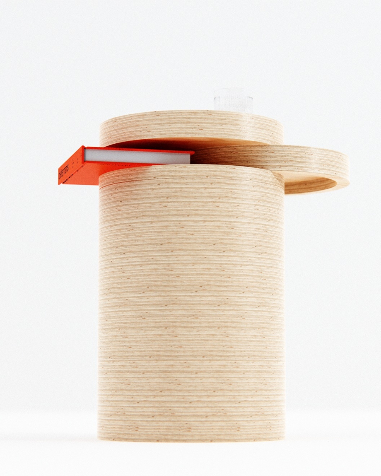
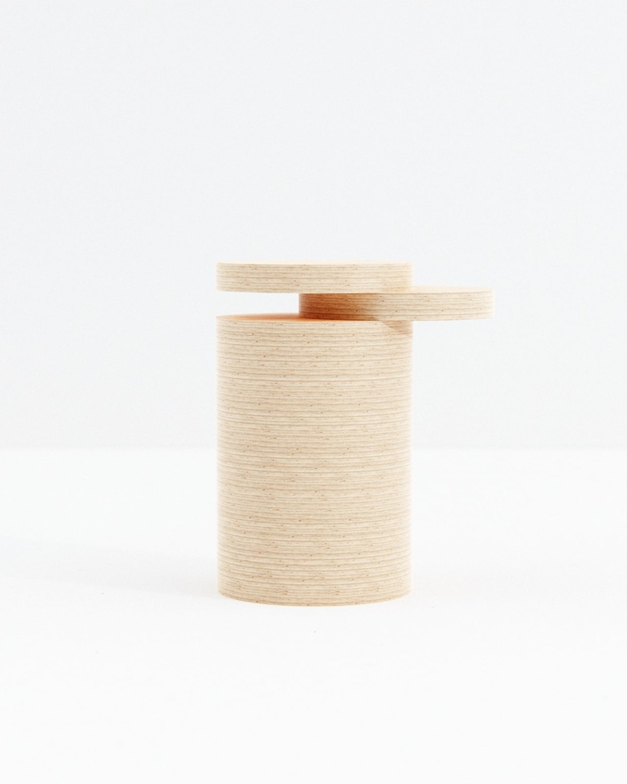
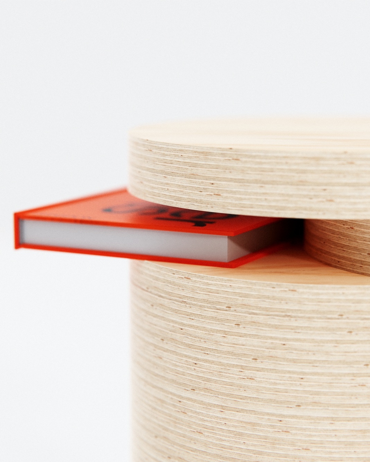
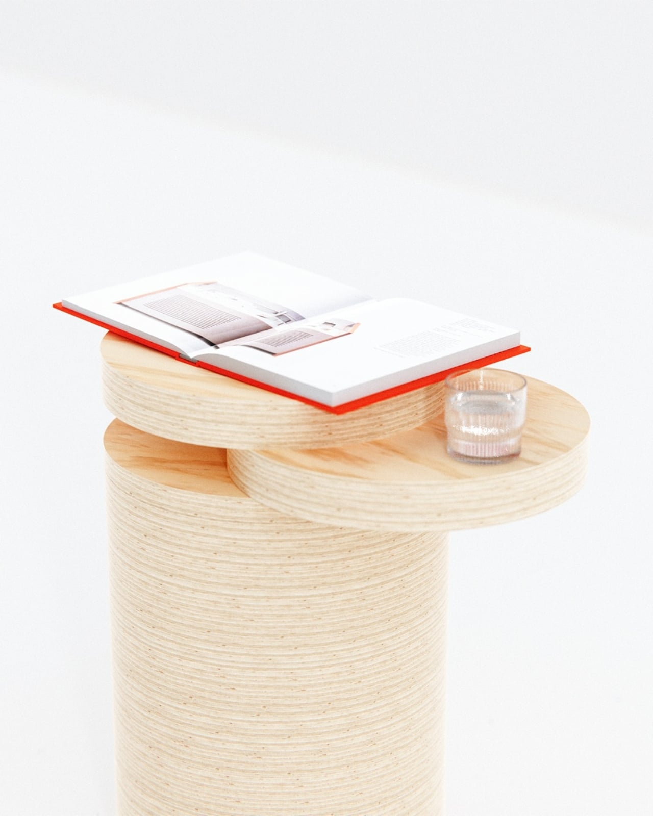
Liam de la Bedoyere, the designer behind Bored Eye Design, built the Nudge Side Table around a different premise. The storage isn’t added to the table. It is the table. A thick cylindrical column of stacked plywood discs rises straight up, and near the top, two large circular platforms sit at slightly different heights, offset from each other just enough to open a horizontal slot between them. That slot fits a book. No drawer, no shelf bracket, no hinge. The gap does the work, and the gap only exists because one disc was deliberately nudged out of alignment with the other.
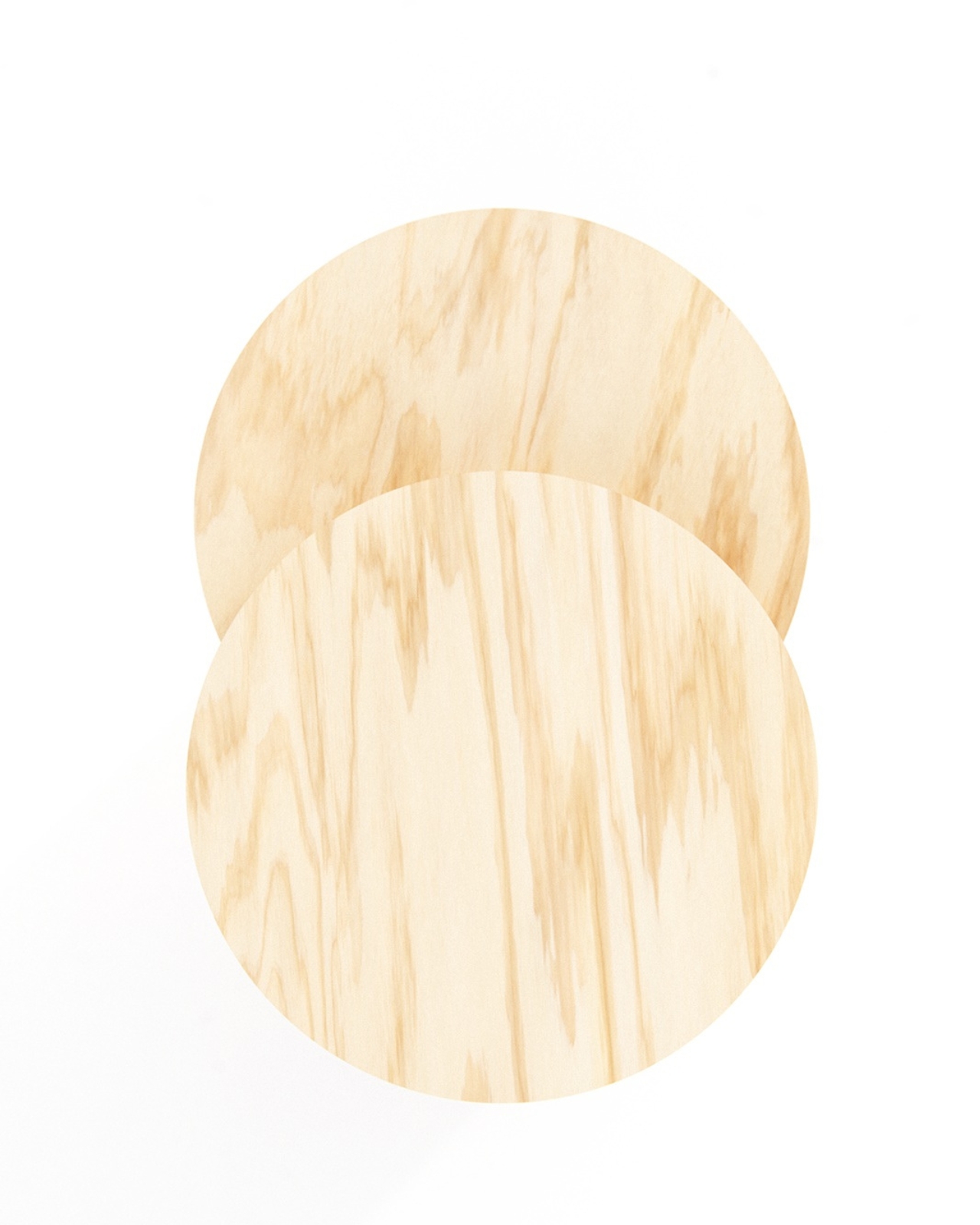
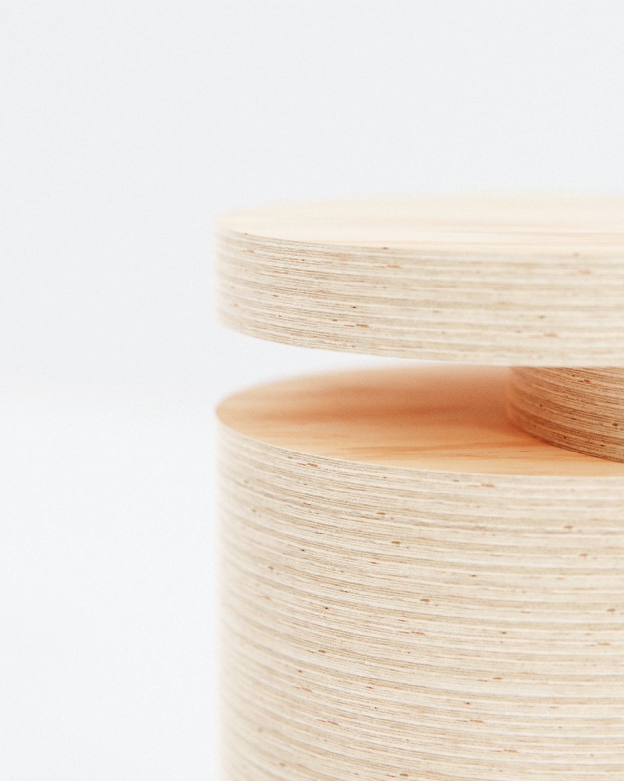
Designer Name: Liam de la Bedoyere (boredeye design) The material choice earns its place here. Plywood is not a compromise; it’s a decision. Looking at the cylindrical body of the Nudge table, every individual layer is exposed on the curved surface, running around the column in thin parallel lines like growth rings on a cross-section of a tree. Up close, the texture reads almost geological, warm and stratified, with the natural variation in the pine grain showing through the smooth flat tops of both platforms. From above, the two circles overlap partially in a configuration that looks less like furniture and more like a Venn diagram drawn by someone who actually cared about geometry. The proportions matter a lot here. The column is wide enough to feel substantial without being squat, and tall enough that the offset platforms land at a genuinely useful height next to a sofa or armchair. The upper disc sits slightly higher and further back; the lower disc projects forward, and the book rests in the slot between them, its spine flush with the edge. From the front, a bright red cover peeking out of the gap adds exactly the kind of color accent the natural pine needs. De la Bedoyere didn’t paint anything or add contrast artificially. He let the objects that live on the table do that instead, which is a confident move. From certain angles, the silhouette is almost totemic. Two thick circles floating above a ribbed cylinder, slightly misaligned, the book suspended horizontally between them. It photographs like sculpture, but it functions without any instruction required. You look at it and immediately understand where the book goes. That kind of instant legibility is harder to achieve than it sounds, especially when the mechanism is structural rather than applied. I keep thinking about what this table refuses to include. No joinery hardware buried inside the column. No shelf underneath with a lip to prevent things from sliding off. No rubber feet dressed up in brushed metal. The cylindrical form is self-contained, the platforms are the table, and the offset between them is the storage. Every potential addition was apparently considered and then left out, which is a discipline that most furniture design at any price point genuinely struggles with. De la Bedoyere has been working through this problem across several pieces now. His Notch table earlier this year carved a vertical slot into a set of solid wooden legs for the same purpose. The Nudge table arrives at a similar conclusion through a completely different construction logic, stacking instead of subtracting, horizontal storage instead of vertical, two surfaces instead of one. Same stubbornness about keeping things elemental, different answer. Side tables rarely attract this level of structural thinking. They get treated as the afterthought of the living room, bought last and replaced first. The Nudge table argues that the piece sitting closest to how you actually spend your time at home deserves more than a flat top and a prayer. Sometimes the most useful thing a designer can do is move one circle slightly to the left and let the gap speak for itself. The post A Side Table That Actually Hides Books in Plain Sight first appeared on Yanko Design. 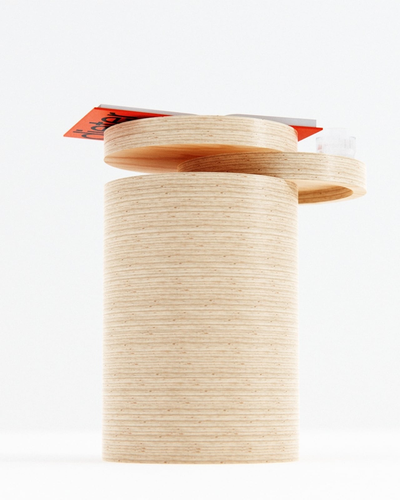
本内容采集自海外公开设计资源「Yanko Design」。原作者/机构:Ida Torres。原文链接:https://www.yankodesign.com/2026/09/20/a-side-table-that-actually-hides-books-in-plain-sight/?utm_source=rss&utm_medium=rss&utm_campaign=a-side-table-that-actually-hides-books-in-plain-sight。授权说明:RS